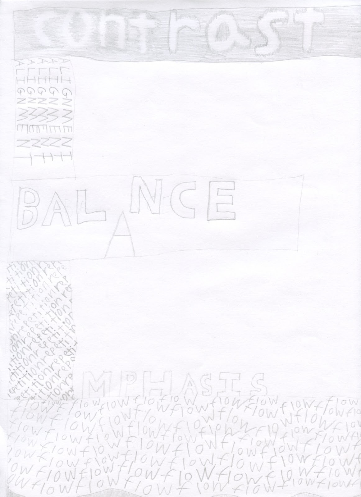
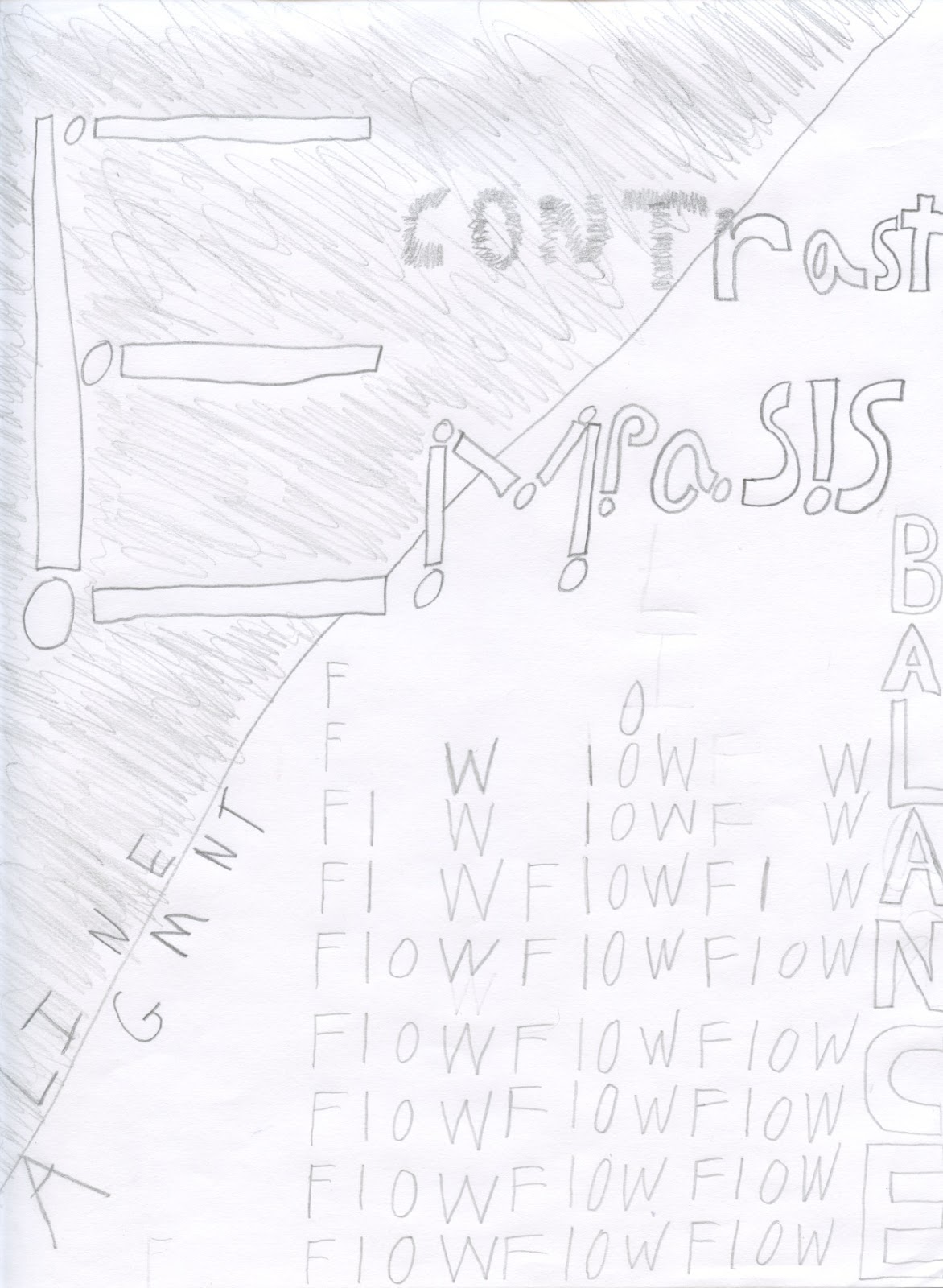
For my thumbnail I mostly randomly tried different ways to fit the different word designs in with each other until I though they lined up with each other in a way that the eye would travel from one to the other even if it is not in any specific order. I feel that the words travel mostly between emphasis, balance, and alignment as a boundary around everything and the other words flow, repetition, and contrast work with what direction that it should be going.
As for the list of words and how I made them look like there meaning for emphasis I choose one out of three to be larger and more bolder so that it would stand out. Balance I tried to equal the black and white to give it a leveled look. Alignment I did the basic letters on top of one another with them also getting smaller so it would give a tower look. Repetition I put in a circle so it would constantly be going with no end and to also try to draw the eye to go in that direction to get it to see the other words. Contrast I put so it has a look that sticks out so it can bring the eye to repetition incase it isn’t really noticed. Finally for flow I had the word multiplied and faced in a direction that would fill up any un-used space that would stick out but not too much so that it would make it feel crowded.