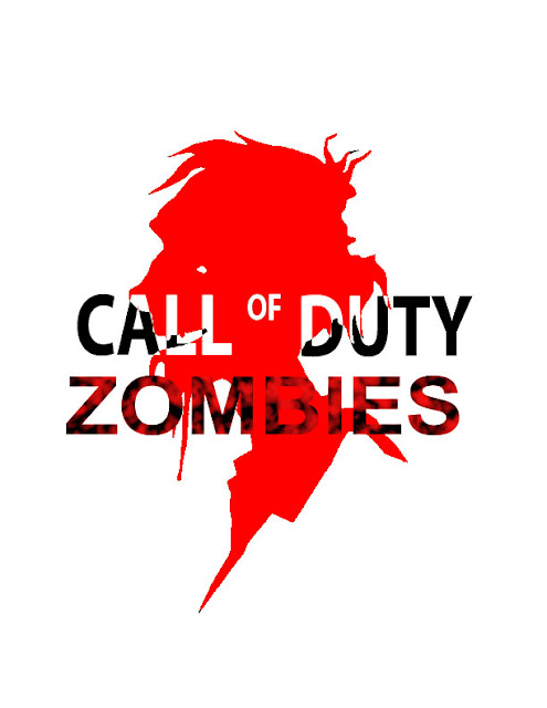
I took some of the advice that was given to me and made a few
changes to the final look of my product. The changes I made
were to the brightness of the entire product since it was too hard
to see. The font of the logo so it looks more like how the
CALL OF DUTY logo looks. I'm still changing the placement of the logo
for a better look. Lastly for the zombies part of the logo I used a small
glow behind it to make it more readable.


